Braiding Data to Save Lives
A collaborative web tool for organizing, sorting, and interpreting open-ended research responses about youth suicidal ideation.
- Role
- Design + build (solo), with lab feedback
- Context
- NYU Tandon People + Technology Lab
- Timeline
- May 2026 – present
- Tools
- Figma, Lovable, web development
Overview
I joined NYU Tandon's People + Technology Lab in summer 2026 as part of Braiding Data to Save Lives, a prototype data platform that connects California Healthy Kids Survey responses with county-level public datasets to examine suicidal ideation in a place-based context.
The lab works through a human-centered design approach, combining participatory research, qualitative analysis, visual communication, and interface design. Within the project I designed an educational zine, helped complete a high-fidelity redesign of the platform, supported the Youth Suicide Research Consortium, and built this collaborative response-sorting website.
Problem
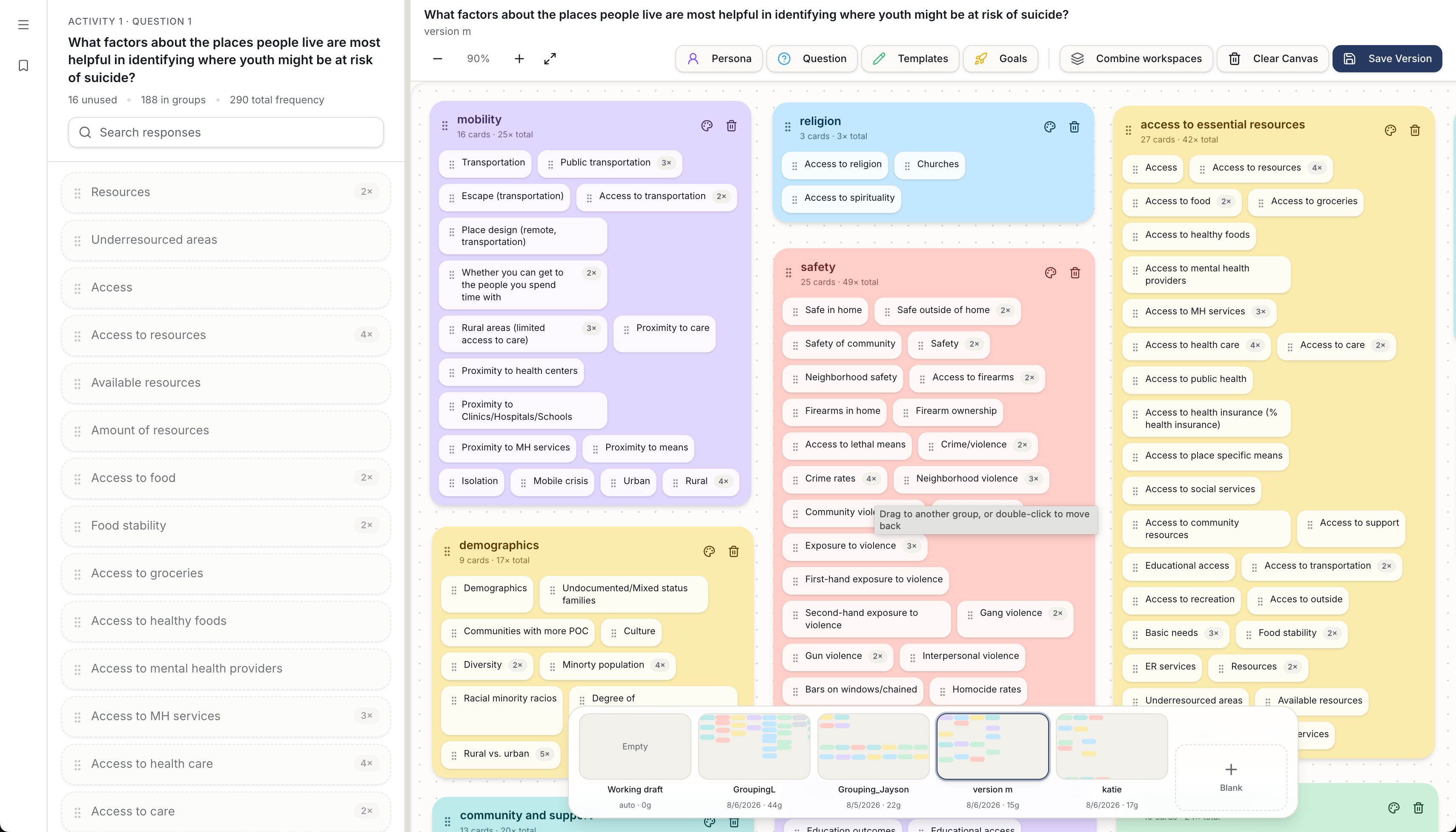
Open-ended responses gathered at the Youth Suicide Research Consortium needed a way to be organized and interpreted by several researchers at once — without forcing the team into one single organizational structure.
The tool
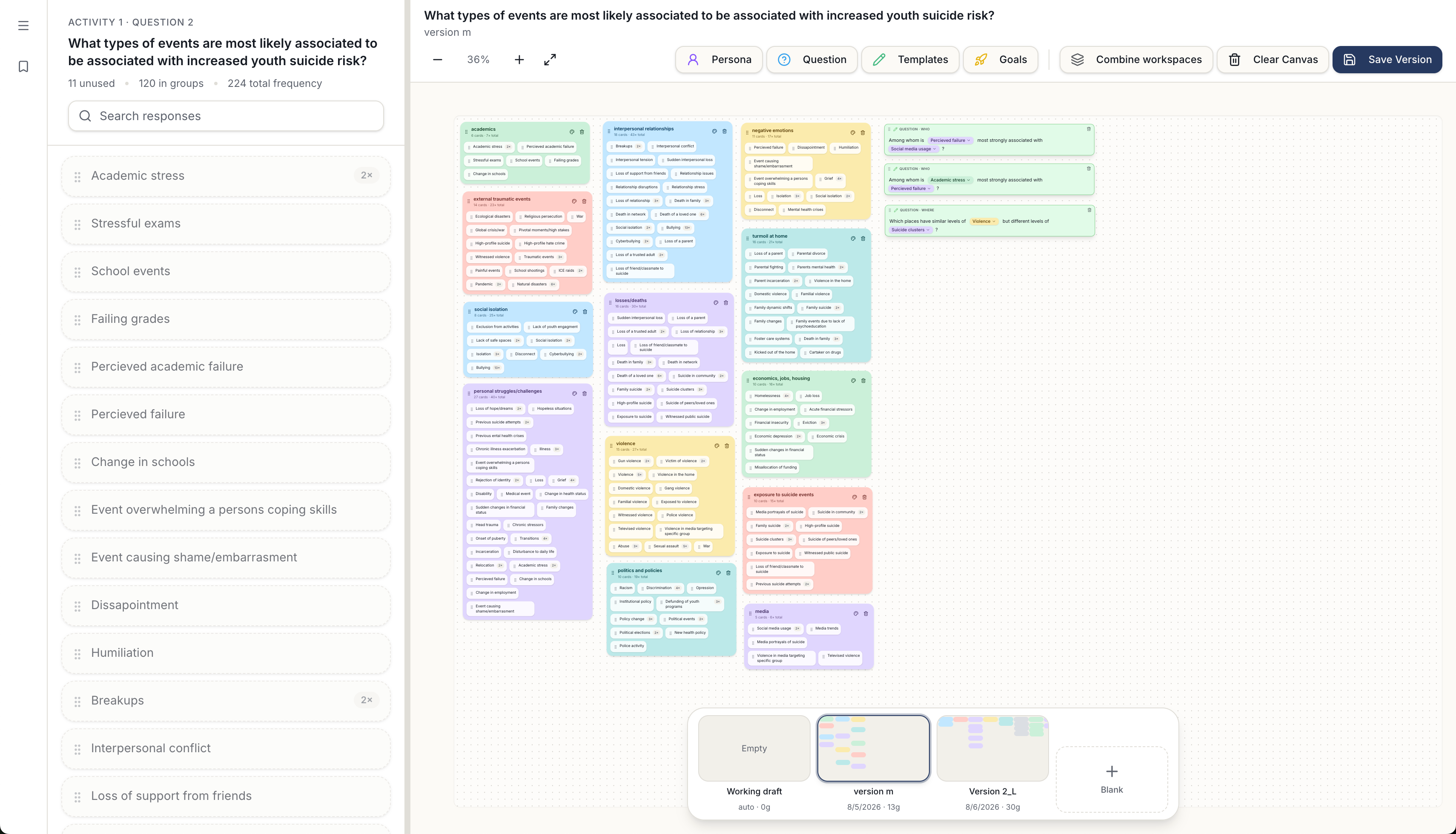
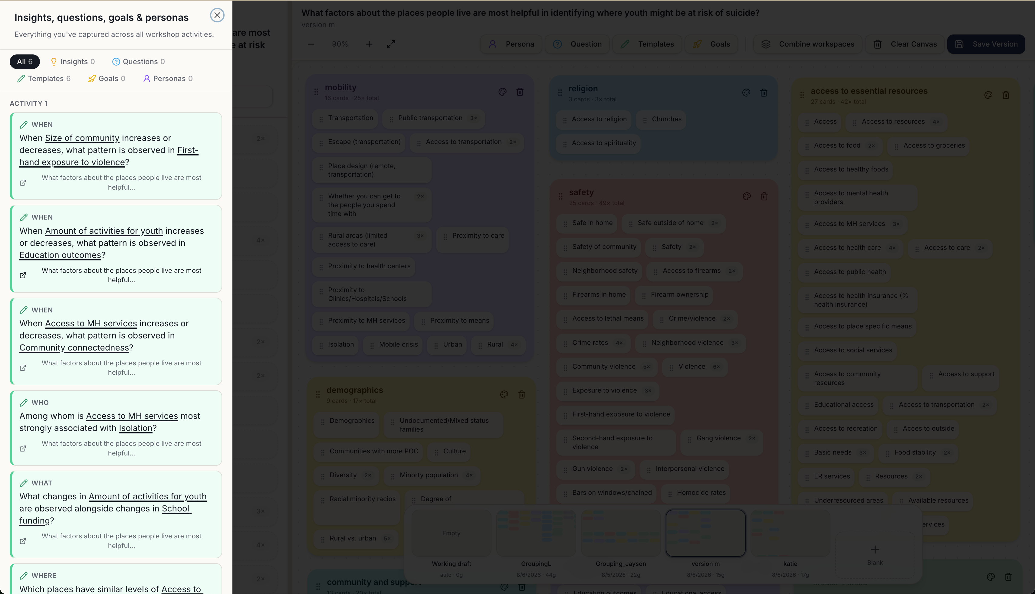
Researchers arrange responses into flexible groups, develop insights, and use structured question templates that turn emerging patterns into new questions to explore through the larger Braiding Data system. The templates are written to encourage curiosity and move from qualitative observation toward possible relationships between people, place, and data.
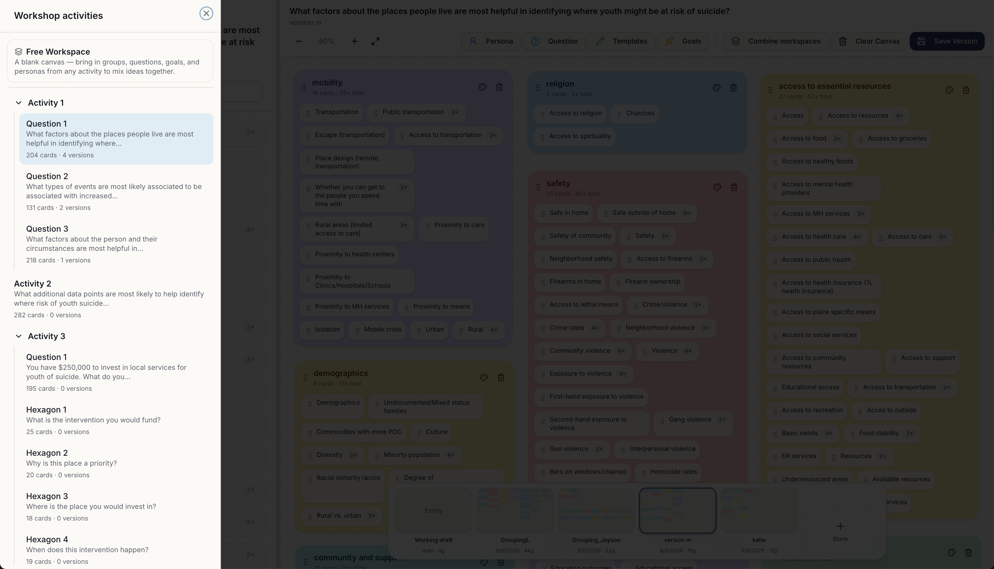
A cloud-based workspace with autosaving and shared access supports both individual exploration and collaborative analysis. Each researcher can build their own groupings, questions, and insights while still seeing and building on the work of others. Shared groups and ideas can be pulled into a freeform workspace so different interpretations of the same responses can coexist.
Key design decisions
Because the tool supports many different actions, I kept the interface approachable and the interactions familiar.
- Navigation follows clear tab and page structures rather than a novel spatial model.
- Dragging, renaming, recoloring, deleting, panning, and trackpad zooming reuse interaction patterns people already know.
- Clear labels, recognizable icons, and immediate visual feedback keep a complex research workflow easy to learn.
Process
I began by ideating and designing the site around my professor's goal of a tool to sort and interpret responses collected at the Consortium. I built the initial prototype with AI assistance, then spent two months refining the interface and interactions manually — incorporating team feedback, usability observations, and new ideas as the project evolved.
Related work
The educational zine I designed is part of the same Braiding Data ecosystem and is also shown under Graphic + Illustration.
Next project
Oasis Smart Home Wall Pad →