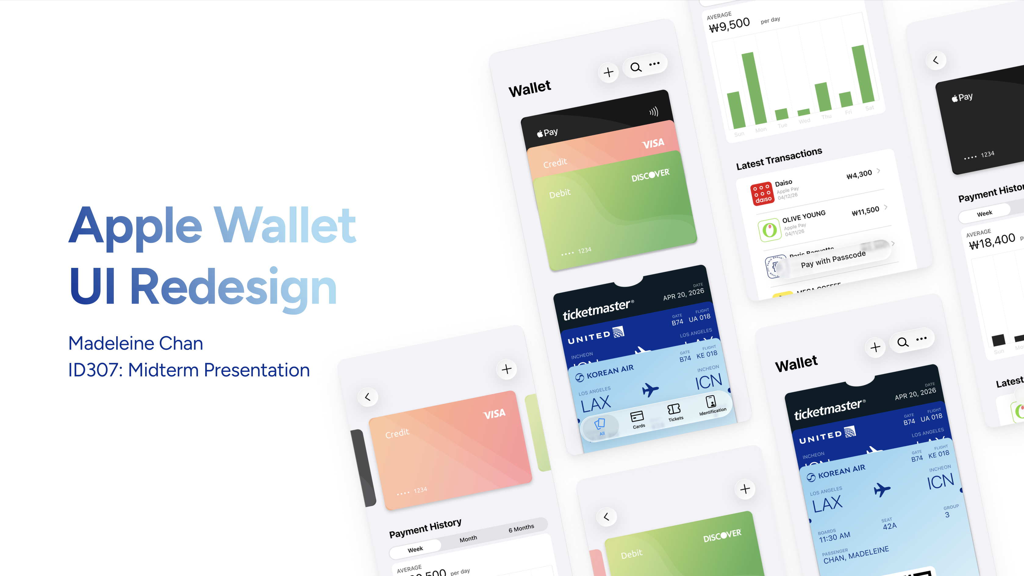
Apple Wallet Redesign
A redesign of Apple Wallet focused on organization, navigation, and clarity — reducing friction in the moments people are most rushed.
- Role
- Solo
- Context
- KAIST, User Interface Design — midterm project
- Timeline
- Exchange semester, 2026
- Tools
- Figma
Overview
The midterm brief was to redesign a few screens and interactions of a common mobile UI. I chose Apple Wallet: it is built to be simple and convenient, but as you add cards, tickets, and passes the experience gets cluttered and inefficient. I focused on usability while keeping a clear, familiar Apple feel.
Direction
The overall goal was to reduce friction in moments where people are in a rush: paying, boarding, or checking tickets.
- Improve organization — strengthen the information architecture by sorting wallet items by type.
- Streamline navigation — reduce friction in the interactions between items.
- Enhance visual clarity — make items and data more visually informative for faster processing.
Process
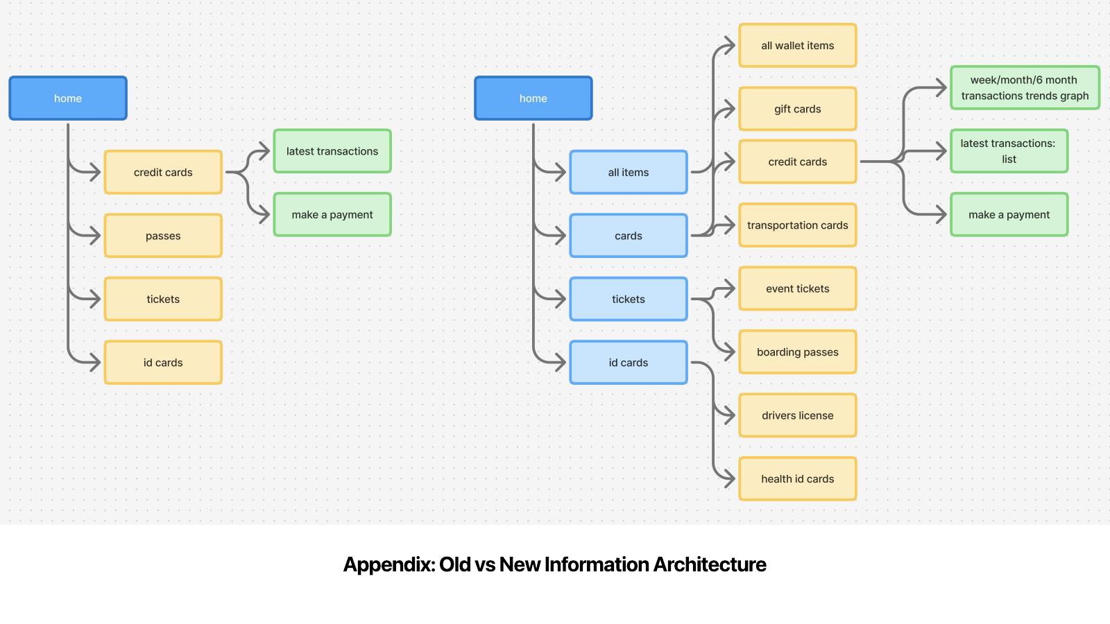
- Define the current information architecture and identify pain points.
- Sketch new layout ideas on paper and build a low-fidelity version in Figma.
- Create assets and a high-fidelity prototype.
- Design interactions and micro-interactions so the prototype feels alive.
Key design decisions
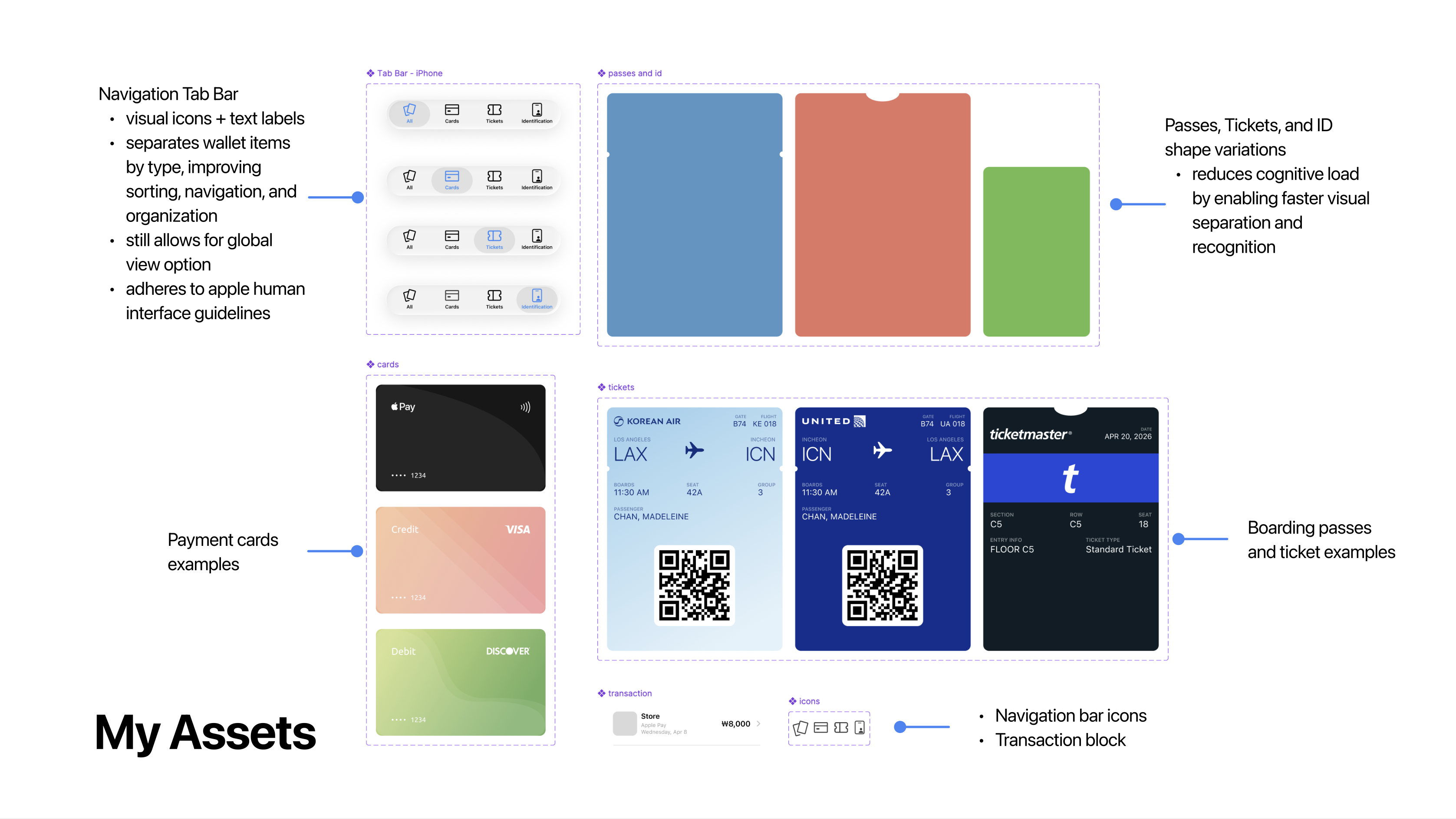
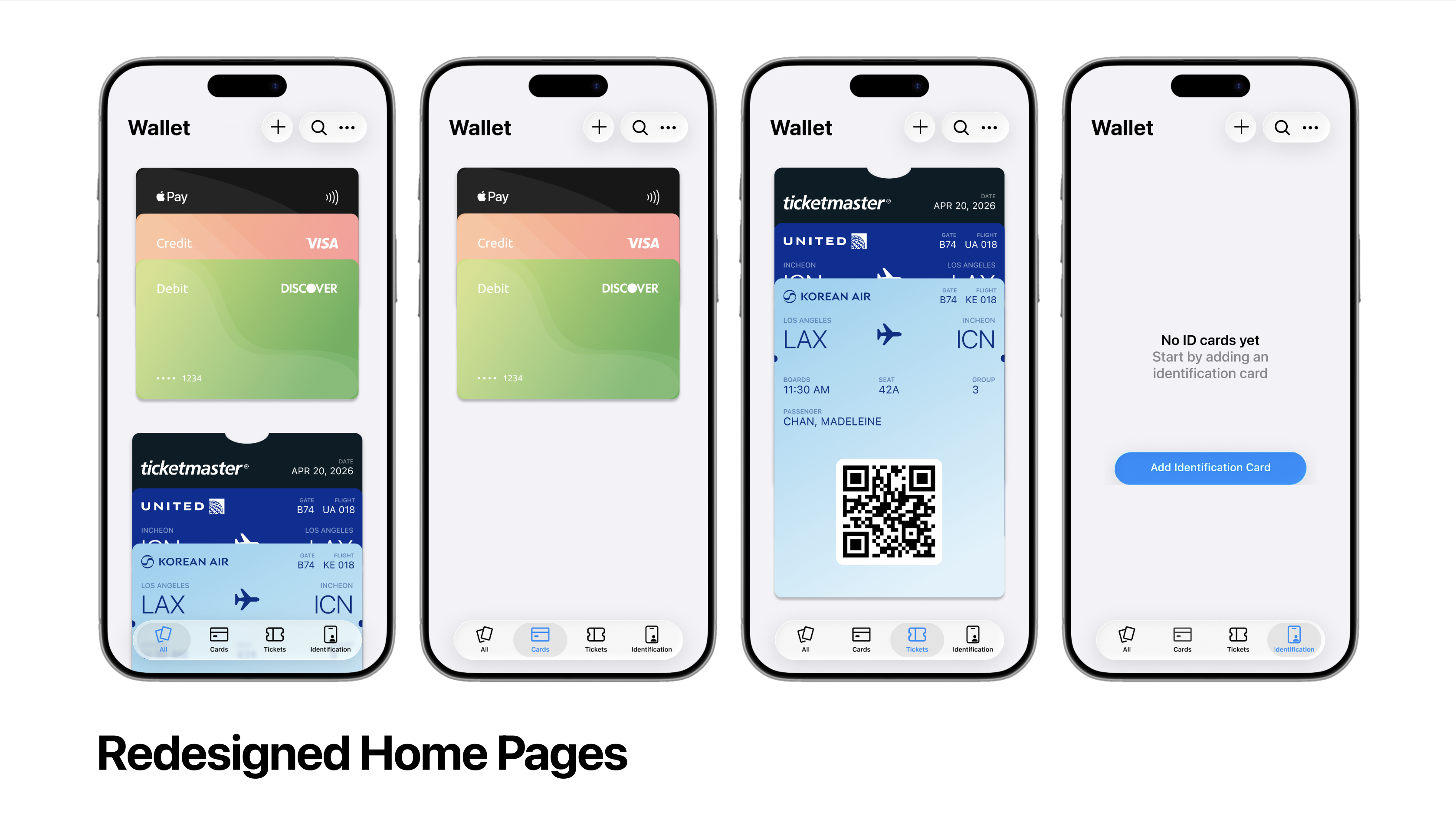
A navigation tab bar separates wallet items by type instead of one long scroll, which makes items much faster to find. I designed it to follow Apple's Human Interface Guidelines so it still feels native to the ecosystem. The "All" tab remains, so people who prefer the original experience aren't forced to change behavior — the design adds flexibility without taking anything away.
I added clearer visual distinctions between item types — event tickets, payment cards, boarding passes — so they're recognizable instantly.
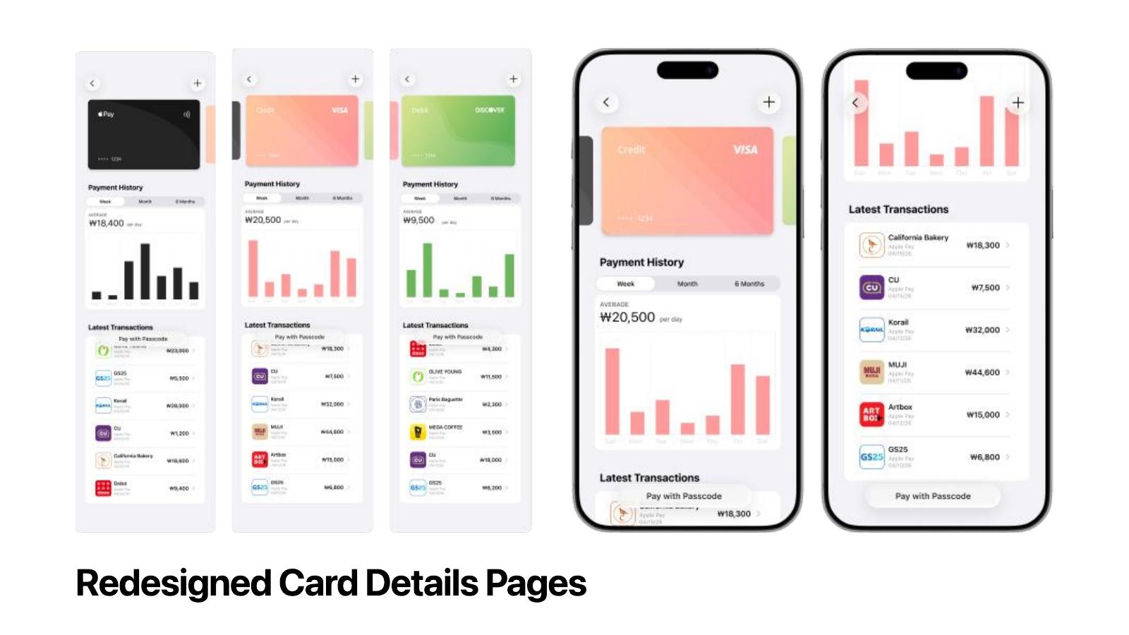
Card detail navigation was a second friction point: today, opening a card locks you into that view and returning to the home page is the only way out. In my redesign you can swipe between cards within the same category, optimizing for recoverability and making misclicks forgiving.
Transaction history in payment cards is text- and number-heavy, so I introduced a bar graph of spending over time. Since payment cards are one of the most-used parts of Wallet, this view makes a meaningful everyday difference.
Result
Together the changes create a clearer visual hierarchy, reduce cognitive load, and make the interface more scannable.
Prototype walkthrough
Next project
Short Story Landing Page →